Images Are Powerful Communicators
Ask any storyteller and they’ll tell you: images are a powerful way to communicate an idea.
Why do images work?
Vision is our dominant sense. Seeing takes up to 50% of our brain’s resources, making us literally hardwired to respond to images. While you can argue that text is also visual, it’s images that do a better job of reaching into our brains and affecting the intuitive, emotional parts of us.
Images are more experiential than text, and because of that, they do a better job of conveying meaning. So while you may have written a compelling 1000-word article on the effects of climate change in your town, your neighbour may have more success with that picture of last year’s flooding.
We also remember information better when it’s presented visually. If you hear something, chances are, 72 hours later, you’ll remember 10% of what you heard. If you see the same message presented visually, after the same time period, you’ll likely remember 65% of it.
All of this adds up to what scientists call the Picture Superiority Effect. For a quick introduction to the concept, here’s a 30 second explanation.
Why would we use images to communicate climate change?
At this point, climate change is largely invisible. We hear about its effects in the news, but it always feels as if it’s happening “over there,” or at least at some point in the distant future.
Images and visualization can help us to connect to what’s happening in ways that text can’t. Pictures of its effects make it easier to understand what climate change is, what it does, and how it could affect our own communities.
Images can also help make the science less abstract. Let’s face it, wading through scientific jargon is not for the faint of heart! But the information the science needs to convey is vitally important, so pictures, images, and info graphics can help communicate that message without dumbing it down.
The lovely folks at Talking Climate have some helpful articles on visual communication and climate change. Stephen R.J. Sheppard, a professor at UBC, pulled together a whole book on the topic. In it, he argues that, for visuals to be most effective, they need to be local. That way, viewers can immediately imagine themselves within the climate scenario presented by the picture. The picture helps bring climate reality closer to home.
How do warning labels fit into that idea?
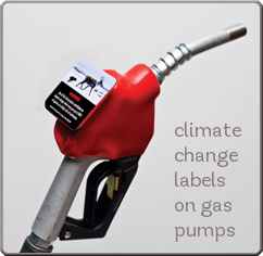
Warning labels on gas pumps harness the power of words and text to convey an important message at a crucial point. Imagine it. I go to fill up my gas tank, and for those few minutes that it takes to fill, I’m holding on to an image of the effects of climate change. It helps to connect my everyday actions with their larger impacts.
And here’s the best part. We designed a few mock labels so we could visually communicate our idea. But, because this is a municipal initiative, each community that adopts these labels is free to design them to fit their local culture, environment, and experience. Let’s say climate change is affecting a particular aspect of the local environment. For example, out west, climate change has interrupted the pine beetle’s natural cycles and allowed them to spread wildly, leaving swaths of dead forest in their wake. A label in British Columbia might show a picture of those forests, thus bringing together our everyday behaviours and their larger impacts.
We can combine images and text in innumerable ways to explore our relationship to climate change. What comes to mind when you think about your own community? If you had a few minutes and two square inches to send someone a message, what would it look like?
Penny Beames
Chief of Communications
Our Horizon
Filed in: blog


